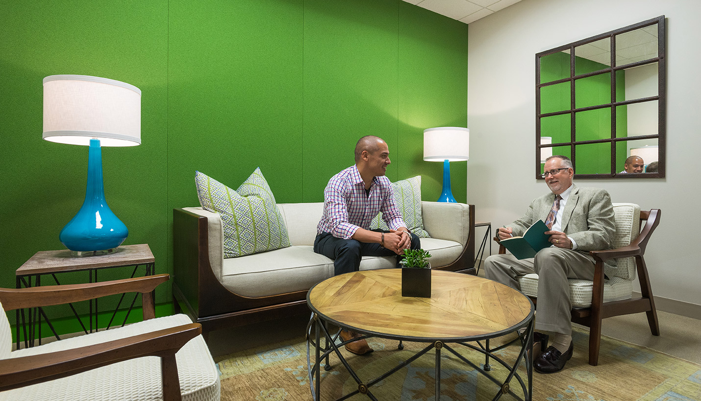
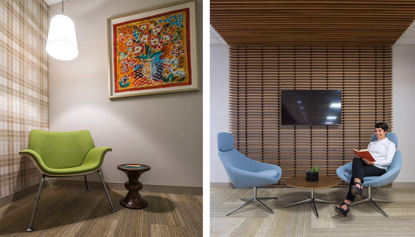
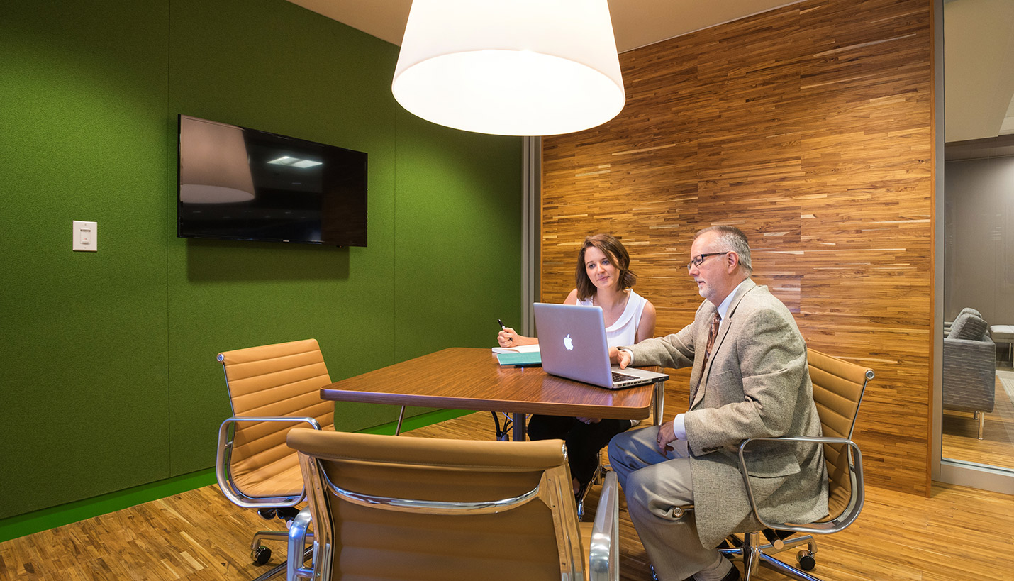
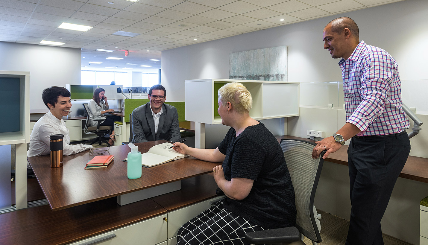
A national single-family residential rental service headquartered in downtown Dallas wanted their new office in the iconic CoAmerica tower feel like home to its employees while they work to provide actual homes for their clients. Page was challenged to blur the line between work and residential spaces in its design, which the firm accomplished through interior architecture, layout, materials, color and artwork.
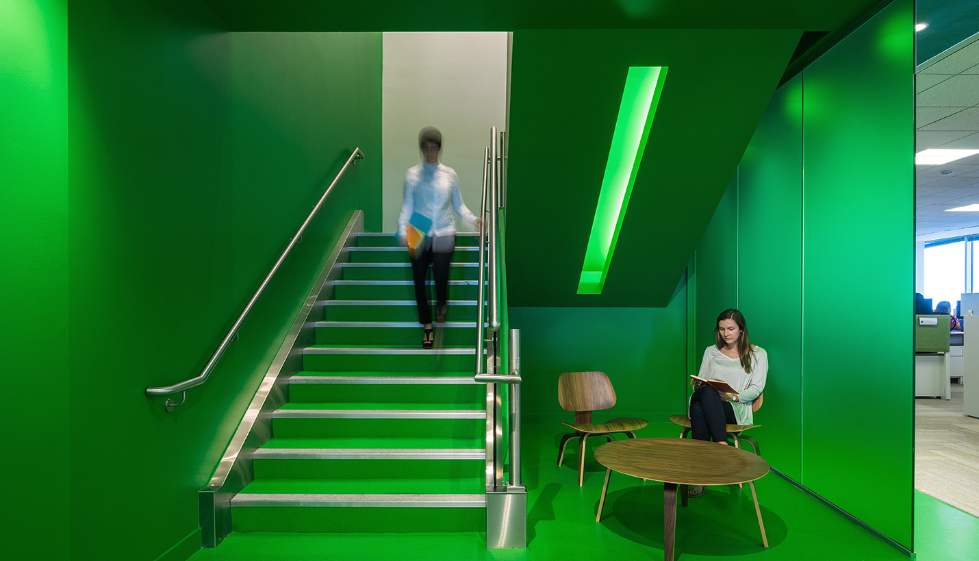
First, Page evaluated how employees at Invitation Home like to approach their work and what their needs were. The split-level 37,000 square foot space already had an integrated “Epic” connector stair, which Page painted in Invitation Home’s new corporate color, an energizing summer green, and designed spaces around it that foster a sense of connectivity.
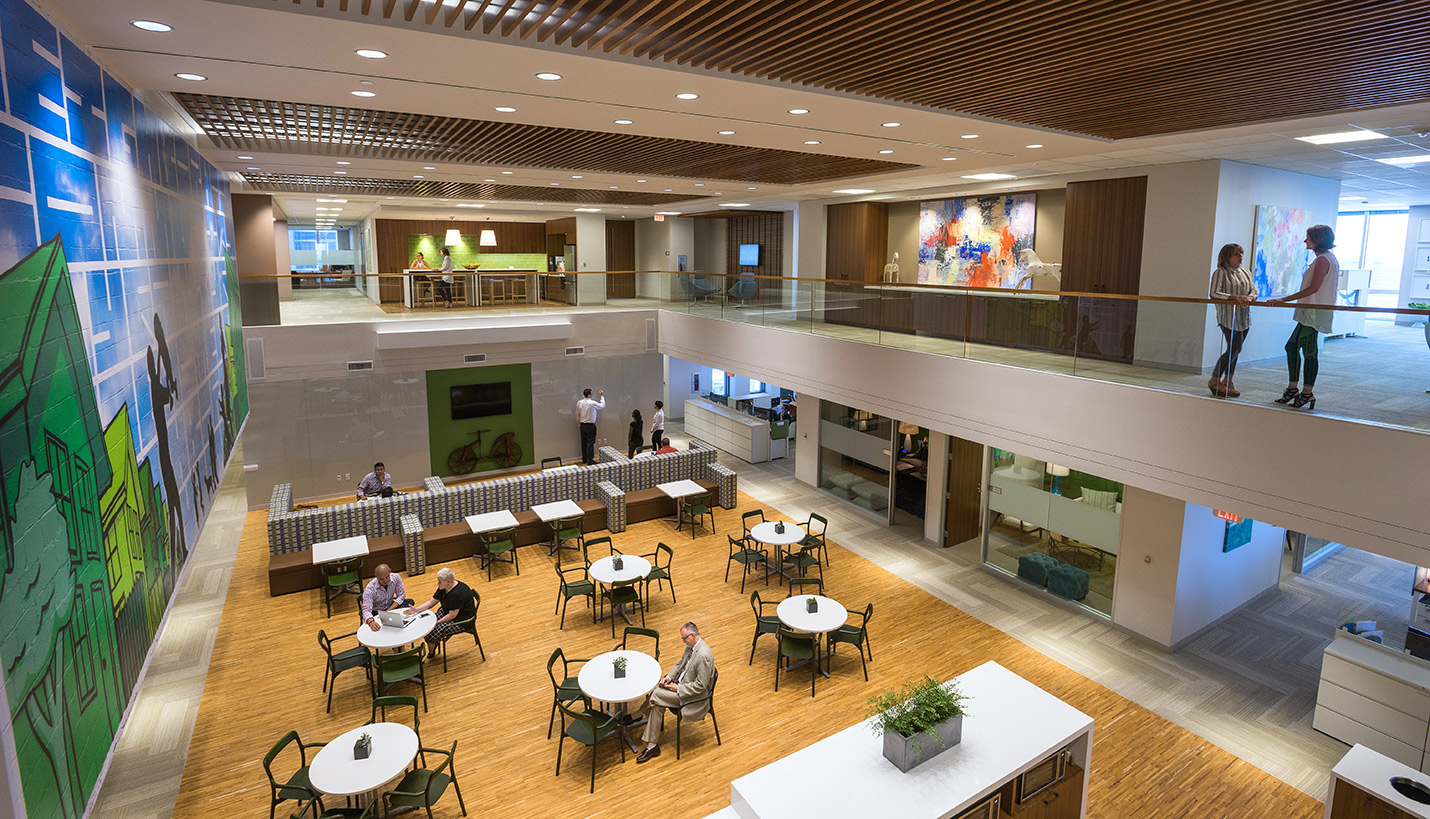
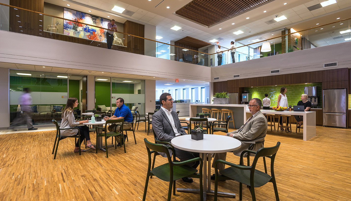
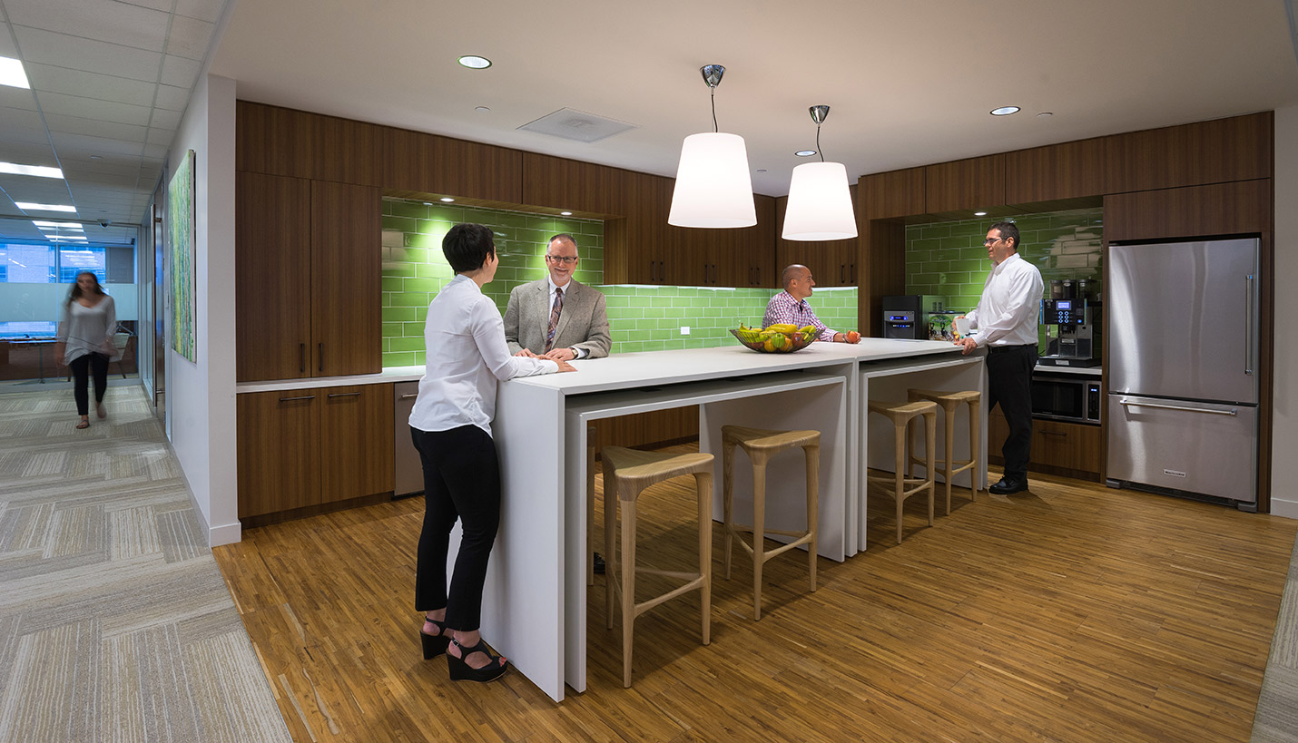
On the lower level, Page situated the large kitchen in a central location surrounded by the second floor mezzanine on three sides which provides open sight lines that facilitate connections between the two floors. Employees dining in the middle of the kitchen space can interact with those walking around the upstairs mezzanine. A custom wall mural in the main kitchen created by a local street artist was inspired by his childhood dream of having a safe, green and welcoming home, which is another connection with the “Epic” stair.
While conference rooms on the perimeter of the kitchen are furnished like spaces that would be found in residences such as living rooms, libraries or dens, many different types of meeting spaces, from a larger formal board room to enclosures for small spontaneous meetings can be found throughout the office. The variation in spaces provide employees with multiple options to collaborate as needed or seek out designated quiet areas to complete tasks. Designated areas were given familiar names such as “Kitchen”, “Living Room”, etc. as opposed to more corporate terms such as break room or conference room.
Within collaborative work spaces upstairs, built-in areas with seamless integrated technology simultaneously accommodate both standing and seated participants. Workstations are grouped into four around a central lowered platform, not unlike a family sitting around a table. When a team needs to chat, they can do so without leaving their desks or doing a gopher “pop-up” over walls. Pin-up areas also are available throughout the office to facilitate creativity and brainstorming. Another, smaller kitchen upstairs also features a green glass tile backsplash creating yet another connection between the two floors.
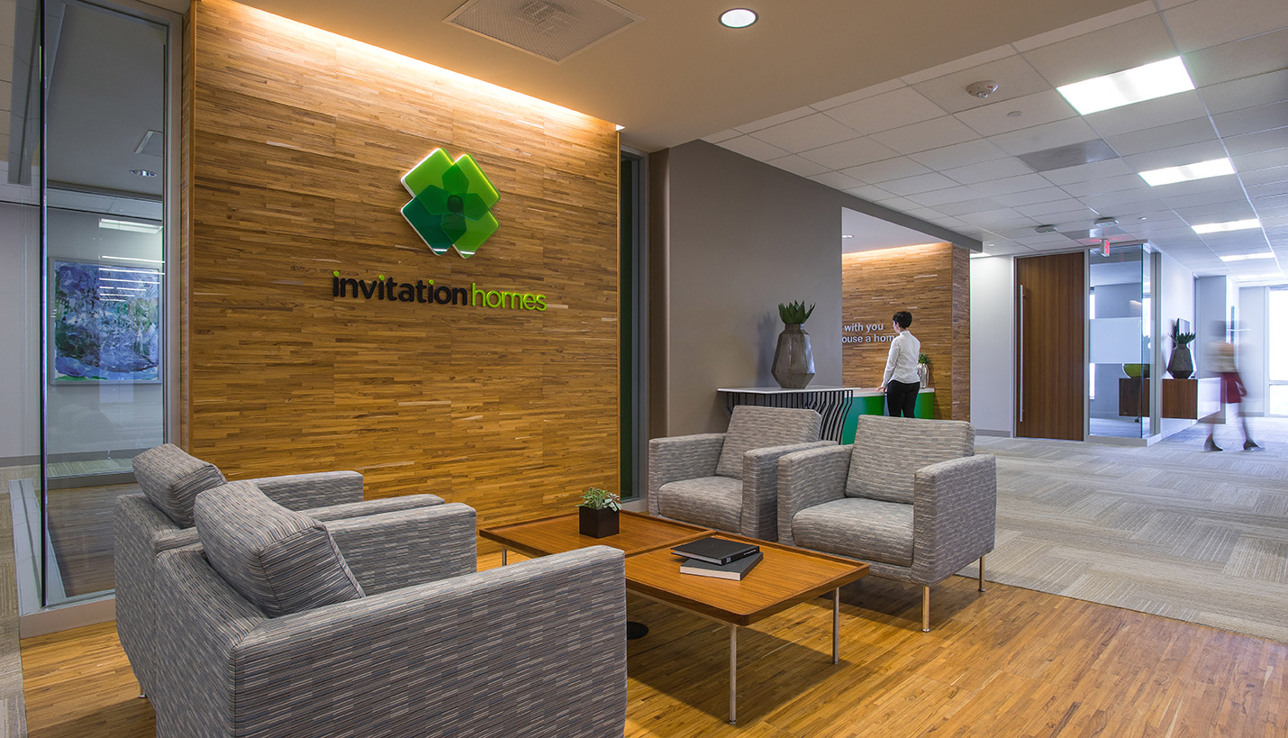
Warm and textured finishes create a sense of home, even in a commercial space. Page used wallcoverings, hardwood flooring, wood veneer casework, and nubby textiles on the furniture, which they designed and sourced. Recessed ceiling panels were filled with louvered wood slats through which light filters, softening the ceiling and making its height seem more comforting. The materials and colors were selected in collaboration with a local graphic design firm that had been tasked with creating and implementing a comprehensive branding package so that the office design and work materials all support the same visual identity.
During the course of the project, Page also provided construction documents and adminstration services.

