


Study of Glazing in Architectural Capitals
Page Associate Principal, architectural designer and design instructor at The University of Texas at Arlington School of Architecture Ricardo Muñoz, AIA, knows the best way to expand his professional expertise is travel. He is a repeat winner of fellowships that have sent him to different continents to study various aspects of design. Most recently, Ricardo was awarded a McDermott Traveling Fellowship from the Dallas Center for Architecture to survey glazing applications in London, a historical city dating back more than 2,000 years that also possesses some of the most modern architecture in the world.
Glazing, or window installation, is crucial to the function of every single building. A properly glazed window can make a tremendous difference to energy efficiency, daylighting and occupant comfort, not to mention keeping the building secure during extreme weather conditions. Distinctive window forms or placement can also result in elevating a building to memorable, even iconic in terms of placemaking and perception of a city’s character.
Ricardo explained his process, “I visited London to walk among its many glass skyscrapers and examine first hand their forms and construction methods. I embarked on the trip with several buildings in mind but discovered many more that were just completed along with several smaller glass structures that seemed to employ equally innovative uses for glass. After London I made a short visit to Paris to explore two recently completed projects which I had been following and that also used glazing in innovative ways.”
Click through the above image gallery to see the structures Ricardo ultimately chose to document and refer below to their respective summaries:
One New Change
Architect: Atelier Jean Nouvel
Completed: 2010
Area: 220,000 SF
Location: New Change, London, UK
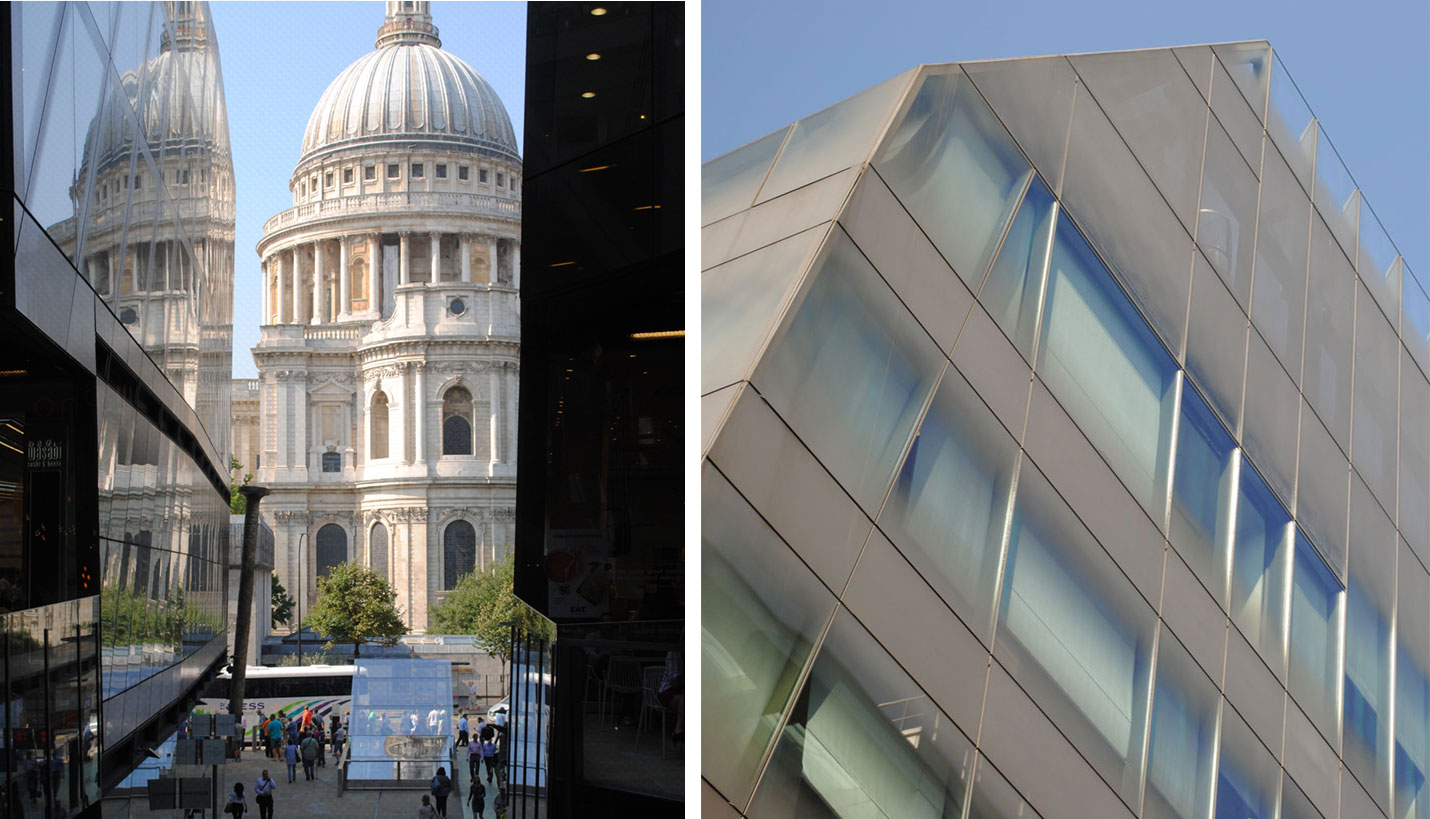
As I began to research this project before visiting it, I was drawn to the brown-grayish color used in the ceramic frit applied to the glazing. The color seemed to be a bold choice considering the fact that architects usually use a neutral frit color. From photographs it appeared that the glass had a dirty appearance and I was anxious to see it in person. As I approached the building from the south I began to note the surrounding buildings and their character. When I arrived at the building I noticed the large angular planes that folded and bent to emphasize certain view corridors. The opaque and ominous exterior gave way to lively and active interior. The culminating view of the cupola of St. Paul’s Cathedral highlighted how a contemporary building could pay respect to its context but at the same time energize the space it occupies. It was from within the building looking out toward the context that I realized that the color of frit on One New Change is referencing the color and character of the surrounding structures and that of many of the buildings in London.
20 Fenchurch Street
Architect: Rafael Viñoly
Completed: 2014
Area: 668,926 SF
Location: 20 Fenchurch Street, London, UK
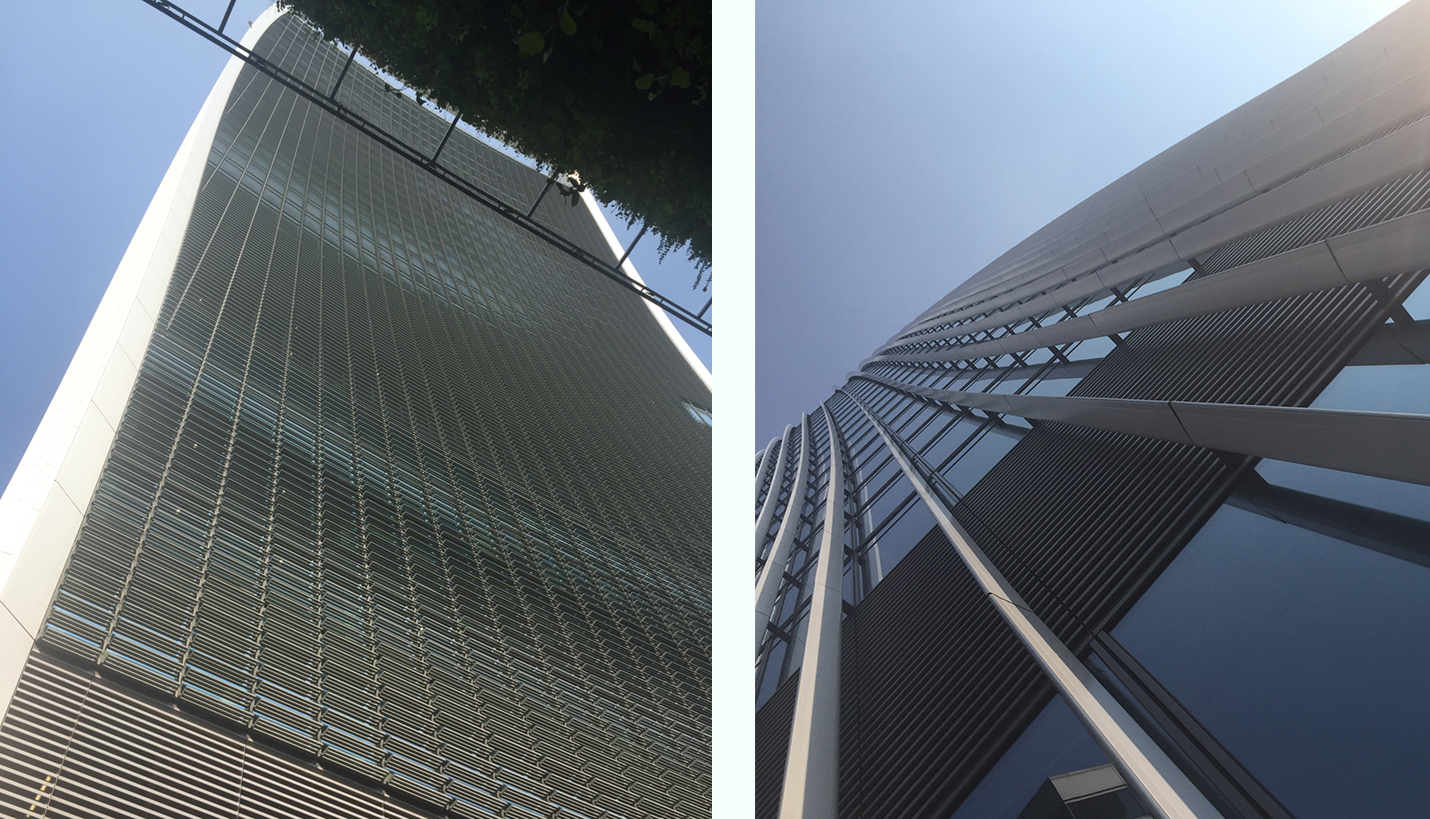
20 Fenchurch, or the “Walkie-Talkie” as Londoners refer to this building, reveals itself in almost shape-shifting ways as one approaches it. At certain moments it appears to have a concave facade and at others convex. It is not until one views it from a long distance that one can appreciate its form. From a close distance however the filigree of the horizontal sun-shading devices is quite beautiful as it allows one to appreciate the gentle curvature of the facade. The vertical fins that travel up the building on the adjacent side are detached from the building and make me wonder if they are truly present to provide shade or if they merely are for aesthetic appearance. Some of these shading devices were implemented after it was discovered that the shape of the building caused an effect of concentrating the sun’s rays to a dangerous degree. Nonetheless, the applied elements work harmoniously with the building. As the building rises it grows laterally which negates the diminishing perspective one usually experiences when looking up at a tower. It seems that from every angle 20 Fenchurch appears differently.
30 St Mary Axe
Architect: Foster + Partners
Completed: 2004
Area: 516,100 SF
Location: 30 St Mary Axe, London, UK
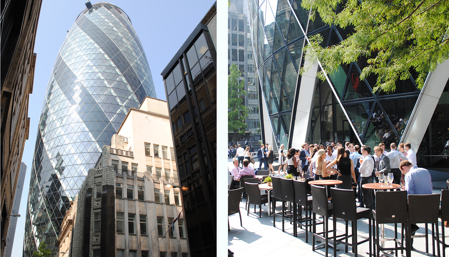
The “Gherkin” (cucumber) was perhaps the building I was looking forward to visiting the most. Its impact on London has changed the skyline and the way the world identifies the city. One of the more interesting aspects of the visit was the large crowd that was gathered during lunchtime. The building served as a modern theatrical backdrop and the openings in its facade again reinforced the idea of scenery as people came and went from within the building. These openings follow the logic of the curtain wall and structural diagrid and create a natural shelter as one enters the building. The curved facade of the building makes it difficult for one to deduce its true scale. However, the repetitive nature of the mullion system allows one to understand the magnitude of the building by comparing the size of glazing at ground level with the same sized glazing units high on the building. The bowing of the building as it approaches its mid-section also gives the slight sensation that the structure is almost providing shelter from the elements much like a roof.
City Hall
Architect: Foster + Partners
Completed: 2002
Area: Unknown
Location: The Queen’s Walk, London, UK
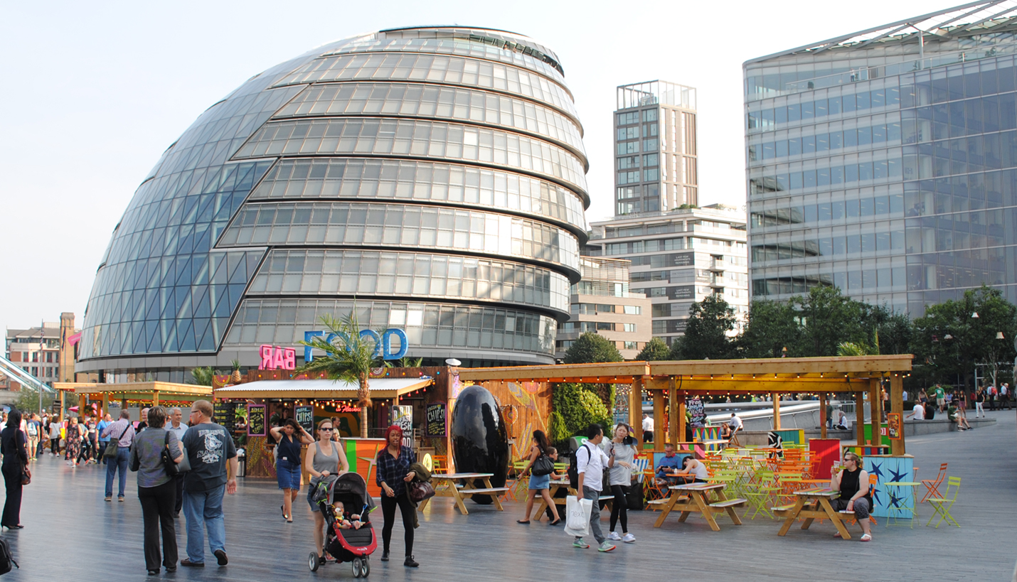
The City Hall building is very visible from many parts in the city as it appears to hover over the southern bank of the Thames. Its unique smooth surface on the north and cascading bands on the south create a juxtaposition that can only truly be appreciated by observing up it close. Although the building is relatively low compared to London’s towering skyscrapers it is filled with incredible detail. On the exterior the different geometries create unique situations which require their own design solutions. Some of these solutions include a diagrid on the north and a more conventional-looking curtain wall system on the remaining envelope. This conventional-looking system however is not conventional at all because by observing it up close it is noticeable that each glazing unit tapers at slightly different angles. Behind the glazing one can also see shading devices that appear to be built into the window system. Inside, occupants ascend a gentle and curving ramp until reaching a point above the seating. From this viewpoint one can see the complexity of circulation systems and structural needs for the building.
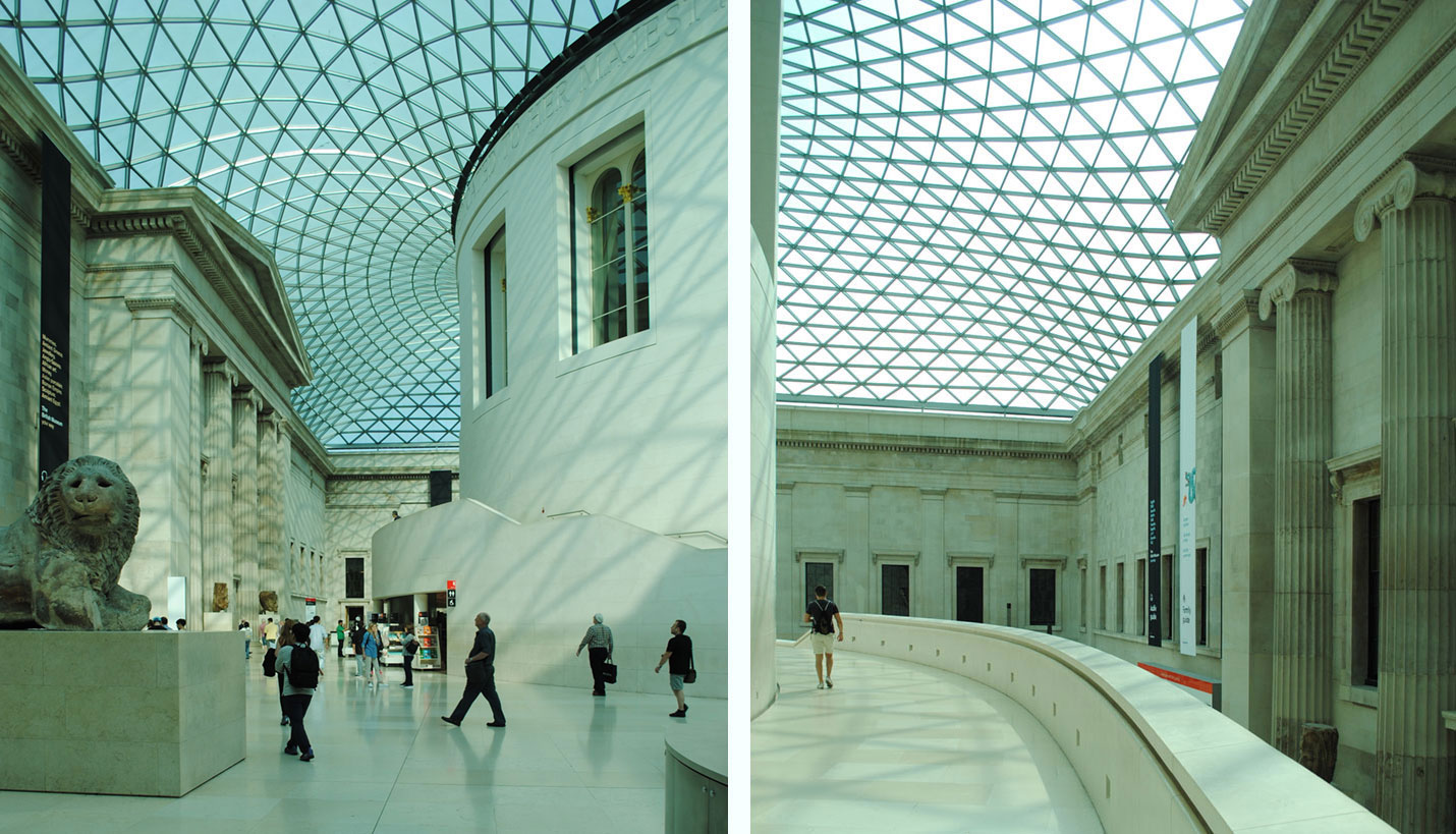
British Museum
Architect: Foster + Partners
Completed: 2000 (Central Court)
Location: Great Russell Street, London, UK
From the exterior of the British Museum the glass cover is not visible but as one passes through the portico into the central court the innovative structure reveals itself. The central court creates the sensation of feeling that one is outside even though one is indeed in a sheltered space. The triangular grid that holds the glazing system allows for the surface to undulate as it touches down on the perimeter of the courtyard which perhaps could not be created as easily with any other shape. This undulating effect reveals the complex curvature of the structure as one walks around the interior. From various viewpoints one is able to appreciate all the different conditions that were present with the existing structure and how negotiating between those and the circular drum at the center of the court could only be achieved with all the movements and structural glazing system. From reviewing photographs taken at the time it is now evident that the glazing must contain a tint because of the blue/green color that falls on everything. While walking under the glass canopy the color is not apparent.
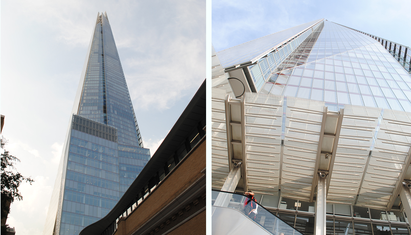
The Shard
Architect: Renzo Piano Building Workshop
Completed: 2013
Location: 32 London Bridge St, London, UK
As the tallest building in Europe the Shard can be seen from many locations throughout the city. The sharp planes that clad the tower change its profile as one views it from different perspectives. These planes terminate in different shapes at the top. They also slightly overlap the edges of the facade that create reveals which travel the height of the building. From up close one is able to see the structure that makes the cantilevered facades possible. At certain locations one is also able to see that the facade planes fold and bend as they touch the bottom of the tower. The large planes of glass do not seem to contain protruding vertical or horizontal mullions and this helps to further emphasize the large planer expanses. Underneath the horizontal mullions there runs a red member that brings some color to the facade but is barely visible if one is not directly looking for it. One of the most interesting things about this building is that at its base there exists a series of functions that tie it to the city such as a Tube stop, shopping, a hospital, etc.
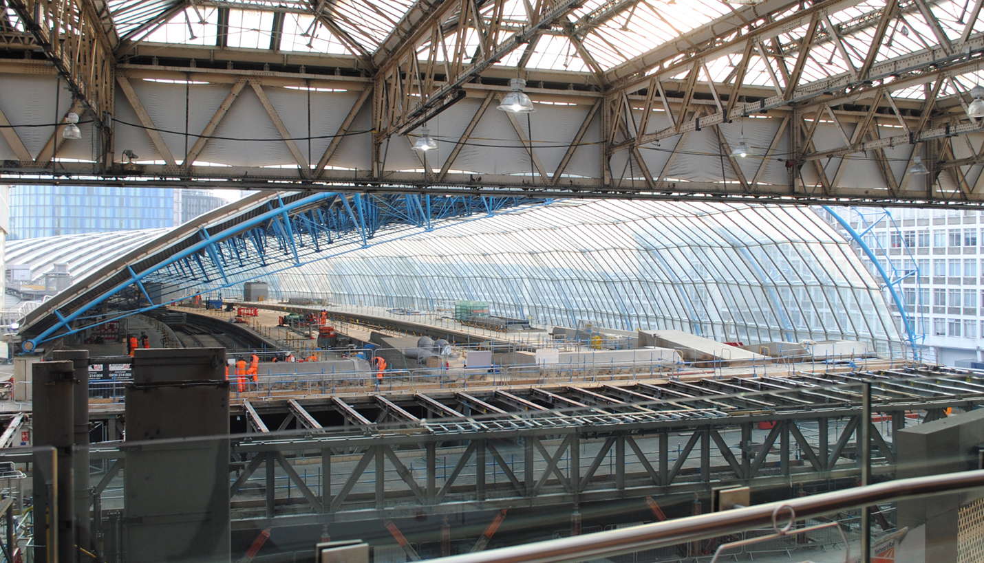
Waterloo International Railway Station
Architect: Grimshaw Architects
Completed: 1993
Location: Waterloo Rd, London, UK
The Waterloo station was one of the projects I was most looking forward to visiting. I wrote a paper in my undergraduate studies about this project and was not disappointed upon visiting. I was not able to walk on the platforms under the structure because of construction, but was nonetheless able to observe it from the interior and exterior. By standing in the historic station I was able to view through the length of the station and appreciate its gentle curving plan. The undulation of the glazing and how it overlaps each subsequent lower pane also becomes very apparent. From this viewpoint one is also able to see how the blue painted structure first is inside the station, and then when the material of the skin transitions from solid to glazing the structure, flips to the exterior. This is perhaps to give the appearance of a more open and unobstructed glass wall. From the exterior one is able to better appreciate the delicate details that make up the structure where each member is sized accordingly. This approach is also evident when examining the steel members in between the glass panes where rectangular voids are present to reduce weight.
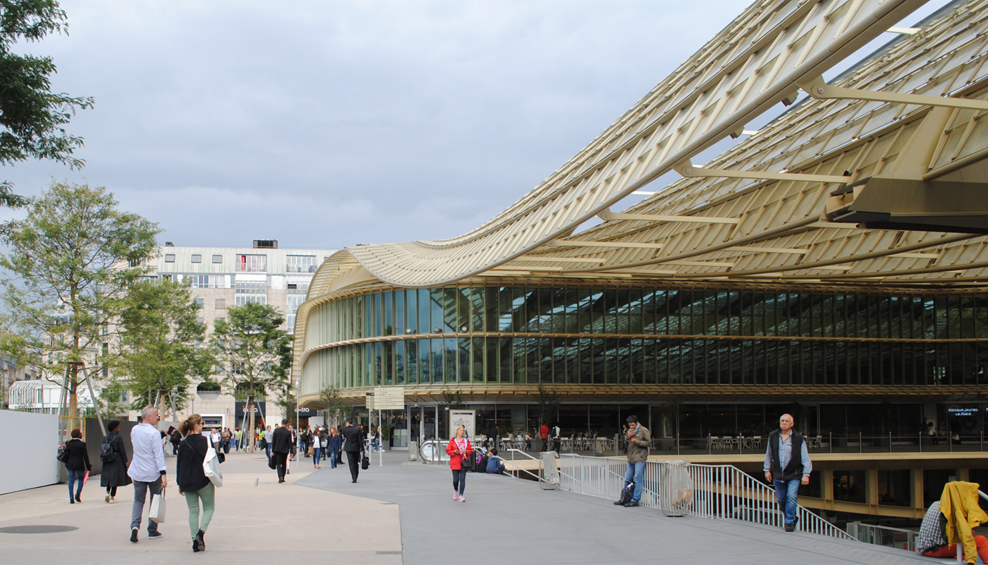
Les Halles
Architect: Patrick Berger and Jacques Anziutti
Completed: 2016
Location: Les Halles, Paris, France
After London I decided to make a short visit in Paris to examine a few recently completed projects that prominently utilize glass. The most visible aspect of the new Les Halles project is a large glass and metal canopy that hovers over the entrance to the sunken entrance to shopping and the Metro station. The undulating form with its golden color makes this space feel special and alive, almost as if the city center is pulsating with activity. While standing underneath the canopy one is amazed by the grandiose space created by the canopy and the two structures on the sides. The elevated portions of these structures also use the golden metal color in addition to green glazing. The lower portions of these structures are a more neutral clear anodized color, perhaps to be more resistant to ground level activity or to give the illusion that the gold megastructure is floating above the ground plane. One peculiar thing about the canopy are the gaps between rows of glazing. One can see how allowing fresh air to enter is a benefit; however it is also evident that even though these rows of glazing overlap rain still can make its way to the plaza. The grand gesture of this playful and flowing structure captures the busy life of downtown Paris.
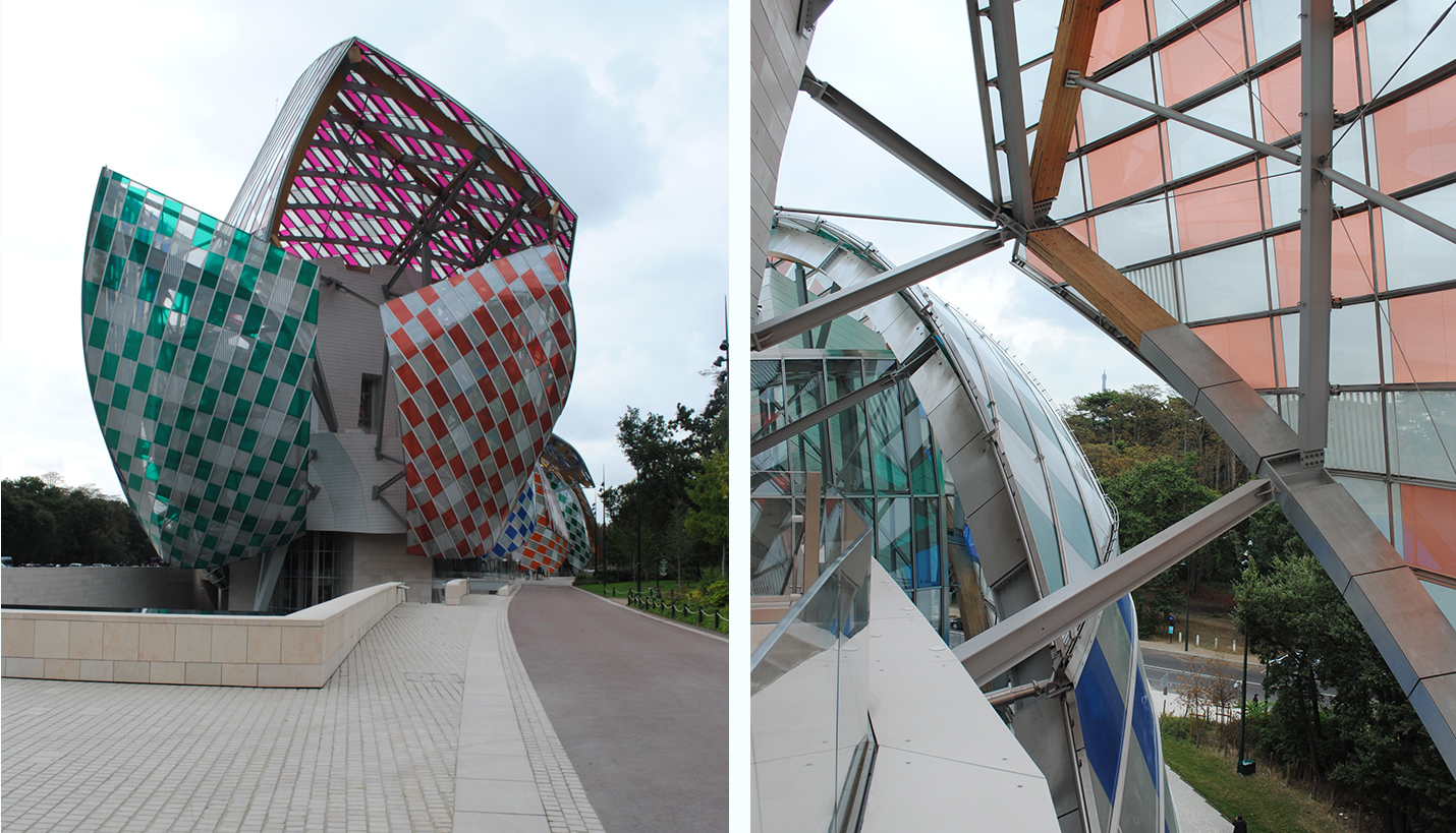
Fondation Louis Vuitton
Architect: Gehry Partners
Completed: 2016
Location: 8 Avenue du Mahatma Gandhi, Paris, France
This project uses glazing in a playful rain-screen type of application. The floating "sails" are made possible by different structural systems that tie back to the “iceberg” at the heart of the project. Some of these structures are steel and others glulam beams. The iceberg holds all the functions of the project and is heavily reinforced to support the soaring glass structures. At the moment that I visited the project the milky white glass sails were covered in a checkerboard of colors. This patterning was an installation by Daniel Buren and helped emphasize and define the forms hovering over the entire building. When approaching the project, one is presented with three large shapes that reach out in one’s direction. Their reach is further emphasized by the sunken water feature. After having passed through the inside of the iceberg one is able to visit the rooftop terraces and more closely examine the glass forms and their construction. The best view of the project however is from across a green lawn in the park in which the building is situated. This view allows one to see the length of the project in its entirety.
To learn about Ricardo's investigative trip to Mitla in the Oaxacan Valley of Mexico, click here.
01/15/2018


