
Step Into My Office: Page Houston
Texas Architect Magazine admired the newly-renovated Page Houston office space in the CBD. Reporter Alyssa Morris asked insightful questions to learn more about the thinking behind the office:
Firm Name: Page
Location: 1100 Louisiana, Suite One, Houston, TX 77002
Size: 32,205 SF
Years in Office: Page was founded in Austin in 1898. The Houston office opened in 1974 and moved to its current location in 2004. It was renovated in 2017.
Type of Projects: Page is an A&E firm serving six market sectors (academic, civic/government, corporate/commercial, healthcare, housing/hospitality and science/technology) and multiple services including planning and consulting.
What is the most typically architect-y thing about your office?
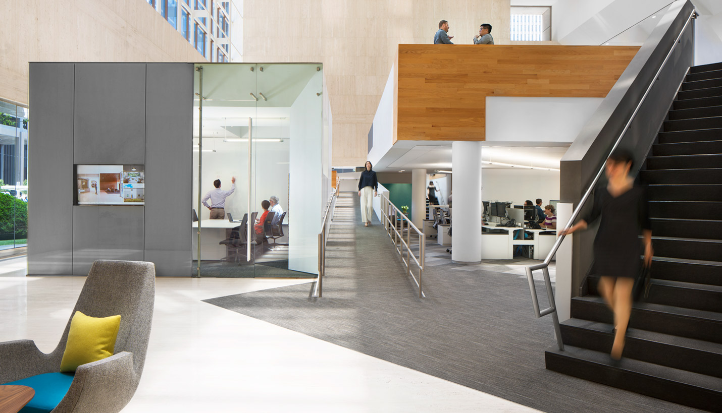
Structural forms are created by the mezzanines within a large atrium-like space.
Describe one feature that makes your office stand out from other firms’ offices:
We have a very tall, prominently visible space facing a major plaza in downtown Houston. Unlike other firms with street presence, our work area is set back from the perimeter glass wall. An inner wall screens the “messy” work and a wide hallway where we host design activities, like furniture rodeos and office socials, puts our culture on display.
Could you describe your office culture in 5 words?
Entrepreneurial, innovative, collaborative, friendly, forward-thinking
How does your office reflect your firm’s aesthetic?
We always tell our clients that we do not have an architectural style and that our projects are truly unique representations of their organizations. This is true of our space; it is a reflection of us: relaxed yet refined. It speaks of creativity.
What changes did you make to the space?
Prior to our renovation, we embarked on a study of our culture conducting surveys, focus groups and observational exercises to evaluate our use of space. This objective approach coupled with our own knowledge of best practices in workplace strategy resulted in the following changes to our workplace:
- Improved mobility via sit-stand desks and centralization of resources, i.e. office supplies, trash receptacles, project storage and layout spaces
- Increased our density to accommodate future growth by reducing the individual desk footprint
- Increased quantities and types of meeting spaces
- New large meeting space to accommodate all-staff training sessions and board meetings
- New focus rooms for heads-down work
- Upgraded technology in all meeting spaces
Favorite element:
Shared stand-up height work surfaces with flat panel displays for dynamic design collaboration.
How does the office affect the way you work?
We are proud of the new office, so that is inspiring. It increases productivity, promotes collaboration and motivates us to do great work.
Clean desk or messy desk?
The smaller desk size has resulted in reduced tendency for hoarding supplies. We have implemented a periodic cleanup for the shared layout spaces.
10/05/2017
People
- Daniel Brooks
- Arturo Chavez
- John N. Cryer III
- Robert Mease
- Tami Merrick
- Andy Phan
- David Quenemoen
- Marissa Yu
Related Posts
- Achieved: Seventh Green Globes Certification In The World
- Winner: Texas Society of Architects Design Award
- The Cistern Brings Home Interior Design Best Of Year Award
- An Extraordinary Win for An Interior
- Historic Downtown Building Update Connecting Tradition with Today
- Historic Page-Renovated Downtown Building Up for Sale
- Art Chavez: Repurpose the old, think globally for the new


