Serving the Brave: Austin VA Outpatient Clinic
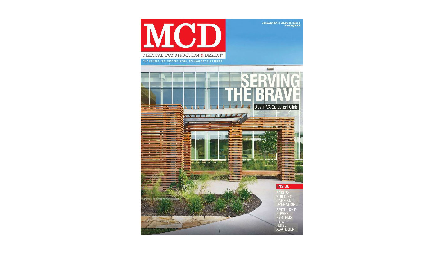
"Serving the Brave: Austin VA Outpatient Clinic," written by Page Principal Kregg Elsass, is the cover article of the July-August 2014 issue of Medical Construction & Design.
At the time of its completion, the 275,000-square-foot facility was the largest leased freestanding VA outpatient clinic in the U.S. The article focuses on the planning and design of the facility, which was designed to meet LEED Silver equivalency.
Please click on the link to see the entire article, "Serving the Brave: Austin VA Outpatient Clinic," by Kregg Elsass, AIA. Medical Construction & Design, July-August, 2014. Photos by Casey Dunn.
Text of article follows:
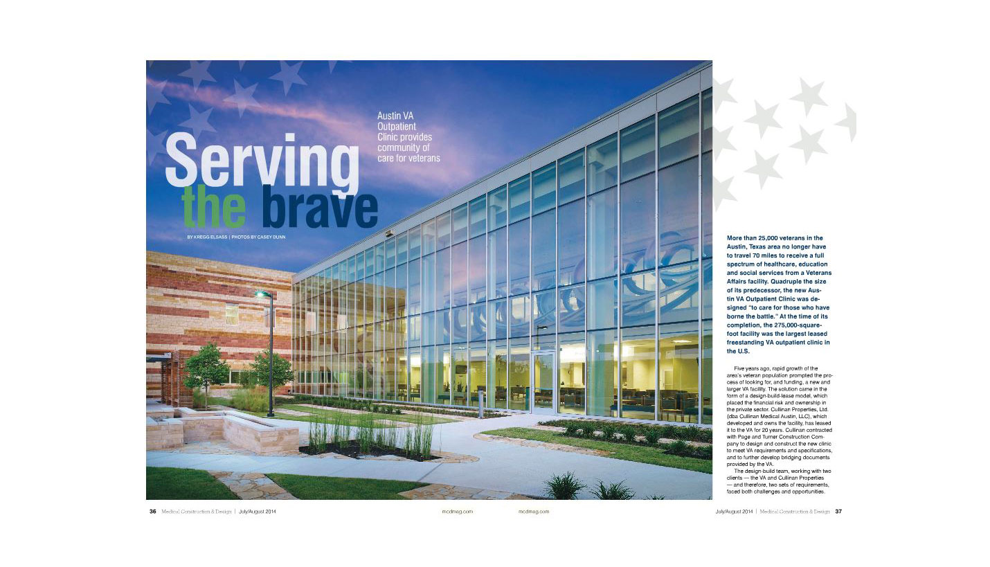
More than 25,000 United States veterans in the Austin, Texas area no longer have to travel 70 miles to receive a full spectrum of healthcare, education and social services from a Veterans Affairs facility. Quadruple the size of its predecessor, the new Austin VA Outpatient Clinic was designed “to care for those who have borne the battle.” At the time of its completion, the 275,000-square-foot facility was the largest leased freestanding VA outpatient clinic in the U.S.
Five years ago, rapid growth of the area’s veteran population prompted the process of looking for, and funding, a new and larger VA facility. The solution came in the form of a design-build-lease model which placed the financial risk and ownership in the private sector. Cullinan Properties, Ltd. (dba Cullinan Medical Austin, LLC), a real estate/development company which developed and owns the facility, has leased it to the VA for 20 years. Cullinan contracted with Page and Turner Construction Company to design and construct the new clinic to meet VA requirements and specifications, and to further develop bridging documents provided by the VA.
The design-build team, working with two clients – the VA and Cullinan Properties – and therefore, two sets of requirements, faced both challenges and opportunities. Efforts to incorporate patient-centric philosophies consistent with Planetree and Evidence-Based Design supported the VA’s goals, as did creating an architectural image that would reflect the unique geological characteristics of Austin and the Texas Hill Country. The team sought ways to adapt the VA’s original bridging documents to include more daylighting, improve way finding, use natural materials and integrate art and nature in a way that would help create a true healing environment. Although the facility serves veterans exclusively, there was concerted effort to integrate current healthcare planning and design concepts from the private sector.
Natural Landscape, Materials Guide Design
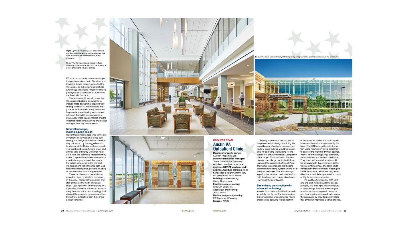
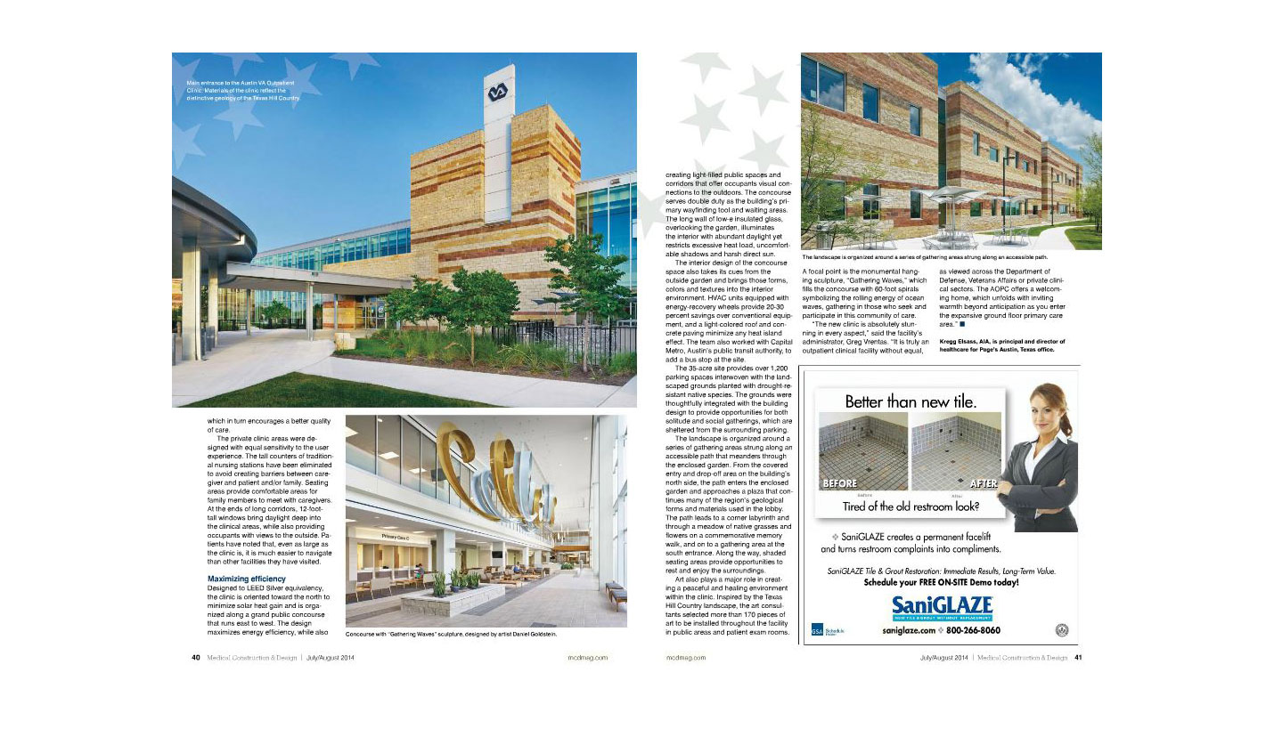
Rather than simply a response to the site conditions of its traditional office park setting, the design of the clinic is noticeably influenced by the rugged natural landscape of the Balcones Escarpment. The weathered stone, flowing water and alluvial soils of nearby McKinney Falls State Park are abstractly represented by native chopped-face limestone masonry, a north-facing curtain wall that opens the public concourse out to the healing garden and the horizontal split-face masonry banding that gives the building its decidedly horizontal appearance. These tactile natural materials are placed in close proximity to the users of the clinic, particularly on patient and staff entries on the north and south sides. Less aesthetic, and therefore less expensive, materials were used in areas away from the entrances, a strategy that allowed the design to remain cost effective without detracting from the central design concepts.
Equally important to the success of the project was to design a building that would be cost-effective to maintain, particularly since Cullinan would be responsible for operating the building for the duration of the 20-year lease. Completion of the project 75 days ahead of schedule was due in large part to the Cullinan team and the concerted efforts of Page and Turner to co-manage the Building Information Management system among all of the team members. This was an ongoing effort that required dedicated staff on both the design and construction teams to oversee the coordination.
In order to accommodate the 21-month schedule, the Turner BIM team realized that the conventional shop drawings review process was delaying the fabrication of materials for trades that had already been coordinated and approved by the team. The BIM team gathered information using robotic surveying equipment to capture the MEP/FP, drywall, ceilings, interior and exterior glazing, casework, structural steel and as-built conditions. They then built a model which could be reviewed with the entire team in the weekly BIM meetings. The team could immediately move from BIM meetings to MEPF fabrication, which not only expedited the schedule but provided accountability for each team member.
The facility’s future users, both veterans and staff, helped guide the design process, and their input is manifested in several ways. Interiors were designed to enhance the care given to veterans and their loved ones, as well as to inspire the caregivers by providing a workplace that gives staff members a sense of pride, which in turn encourages a better quality of care.
The private clinic areas were designed with equal sensitivity to the user experience. The tall counters of traditional nursing stations have been eliminated to avoid creating barriers between caregiver and patient and/or family. Seating areas provide comfortable areas for family members to meet with caregivers. At the ends of long corridors, 12-foot-tall windows bring daylight deep into the clinical areas while also providing occupants with views to the outside. Patients have noted that, even as large as the clinic is, it is much easier to navigate than other facilities they have visited.
Maximizing Efficiency
Designed to LEED Silver equivalency, the clinic is oriented toward the north to minimize solar heat gain and is organized along a grand public concourse that runs east to west. The design maximizes energy efficiency while also creating light-filled public spaces and corridors that offer occupants visual connections to the outdoors. The concourse serves double duty as the building’s primary way finding tool and waiting areas. The long wall of low-e insulated glass, overlooking the garden, illuminates the interior with abundant daylight yet restricts excessive heat load, uncomfortable shadows and harsh direct sun. The interior design of the concourse space also takes its cues from the outside garden and brings those forms, colors and textures into the interior environment. HVAC units equipped with energy recovery wheels provide 20% - 30% savings over conventional equipment, and a light-colored roof and concrete paving minimize any heat island effect. The team also worked with Capital Metro, Austin’s public transit authority, to add a bus stop at the site.
The 35-acre site provides over 1,200 parking spaces interwoven with the landscaped grounds planted with drought-resistant native species. The grounds were thoughtfully integrated with the building design to provide opportunities for both solitude and social gatherings which are sheltered from the surrounding parking. The landscape is organized around a series of gathering areas strung along an accessible path that meanders through the enclosed garden. From the covered entry and drop-off area on the building’s north side, the path enters the enclosed garden and approaches a plaza that continues many of the region’s geological forms and materials used in the lobby. The path leads to a corner labyrinth and through a meadow of native grasses and flowers on a commemorative memory walk, and on to a gathering area at the south entrance. Along the way, shaded seating areas provide opportunities to rest and enjoy the surroundings.
Art also plays a major role in creating a peaceful and healing environment within the clinic. Inspired by the Texas Hill Country landscape, the art consultants selected more than 170 pieces of art to be installed throughout the facility in public areas and patient exam rooms. A focal point is the monumental hanging sculpture, “Gathering Waves,” which fills the concourse with 60-foot spirals symbolizing the rolling energy of ocean waves, gathering in those who seek and participate in this community of care.
“The new clinic is absolutely stunning in every aspect,” said the facility’s Administrator, Greg Vrentas. “It is truly an outpatient clinical facility without equal, as viewed across the Department of Defense, Veterans Affairs, or private clinical sectors. The AOPC offers a welcoming home, which unfolds with inviting warmth beyond anticipation as you enter the expansive ground floor primary care area.”
Contributed By
Kregg Elsass, AIA
08/04/2014
People
- John R. Blair
- Robert E. Burke
- Brad Cheshire
- Gene Curtis
- Kregg Elsass
- Casey E. England
- Mika England
- Randy R. Gaines
- Shawn-Marie Henson
- Peter B. Hoffmann
- Jeffrey G. Jewesson
- Denny Kumm
- George E. Reeves, III
- Brian D. Roeder
- Brandon Townsend
- Ricardo A. Trevino
- Randy C. Twedt
- Ryan Wells
Related Posts
- New Women, Children's Hospital to Serve Austin
- Healthcare Facility Trends To Watch Today
- Sound Matrix: An Acoustical Design Case Study
- Brainy Building
- Upgrading Aging Mental Hospital To Brain Health Campus
- Breaking Ground on a Ground-up Medical School
- A New Educational Mission: Medical Access for All


