

Leslie Wolke on Digital Wayfinding and Mapping Dell Medical School at UT Austin
Navigating healthcare environments can be confusing and stressful. Austin-based Leslie Wolke is helping large institutions across the country make it easier for people to arrive, get where they need to go and leave without feeling lost. An expert at wayfinding technology, Leslie’s most recent project is MapWell Studio, a customized digital mapping tool and platform.
Leslie is a longtime collaborator with Page Principal Herman Dyal, FAIA. Their projects go back more than 15 years and include wayfinding for large healthcare campuses like MD Anderson Cancer Center in Houston. Their latest collaboration resulted in the first application of MapWell: mapping the health district surrounding Dell Medical School. The project is an extension of the Page/Dyal Branding & Graphics Studio's work on the Dell Medical School visual identity.
Leslie spoke to us about MapWell and wayfinding at Dell Med.
Tell us about some of the wayfinding trends in hospitals and health-focused campuses.
We all use our phones to get where we are going, but when you arrive at a private property Google rarely offers much information at all. This is especially true at health-focused campuses and dramatically impacts the patient experience. To mitigate the stress associated with not knowing where you are going, I have seen more and more health-oriented facilities investing in digital wayfinding.
Institutions are optimizing parts of their websites to facilitate directions and provide navigation tools or they are creating entire dynamic wayfinding applications. For example one of my clients, Cedars-Sinai Hospital in Los Angeles, has installed 2500 Bluetooth low-energy beacons that essentially act like GPS when you are indoors. Visitors can download that app and follow a blue dot from radiology to the cafeteria—all indoors. I think there is a lot of interest in making it easier for people to get around hospitals and health-focused campuses.
What is your primary philosophy for wayfinding?
There are many ways to route people through complicated environments, but I think the main philosophy that Herman and I have employed over the years is using pathways and landmarks. I have codified it into the MapWell platform.
Pathways and landmarks have been around for a long time. But we have honed the types of cues that help people stay on the right path. Especially in healthcare facilities and campuses, where people are often fearful of arriving at the wrong place.
Tell us more about pathways and landmarks.
When we navigate, we look to the architecture, the interior design, and every cue imaginable in the environment to help find our way in an unfamiliar environment. Something memorable could be as simple as a named elevator bank or it could be something as dramatic as the aquariums in a lobby at MD Anderson in Houston.
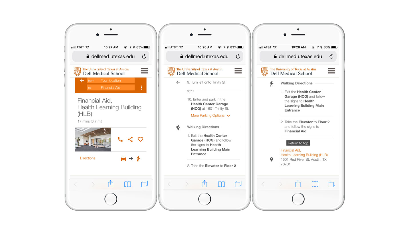
The idea is that you create a wayfinding system that is made up of pathways similar to a subway network with stops and connecting routes. Then you associate destinations with landmarks. You get people to the right parking garage, to the building’s entrance, to the right elevator or stair, to the exact corridor and finally to the front door of their destination.
What is essential to good wayfinding?
Consistency. Consistency in all physical and digital signage is extremely important.
Consider a typical patient experience: A patient is directed to visit radiology for an appointment, the person arrives at the health-focused campus and cannot find the room because it is called “imaging” on all of the physical signs. This adds confusion to a situation that might already be stressful for that individual.
The most successful wayfinding systems give people the confidence to get where they are going and back out of the building without having to ask anyone for directions.
Making sure these spaces are well lit and gracious areas is also important to helping people feel more comfortable that they are going in the right direction.
Tell us about the Dell Med MapWell microsite.
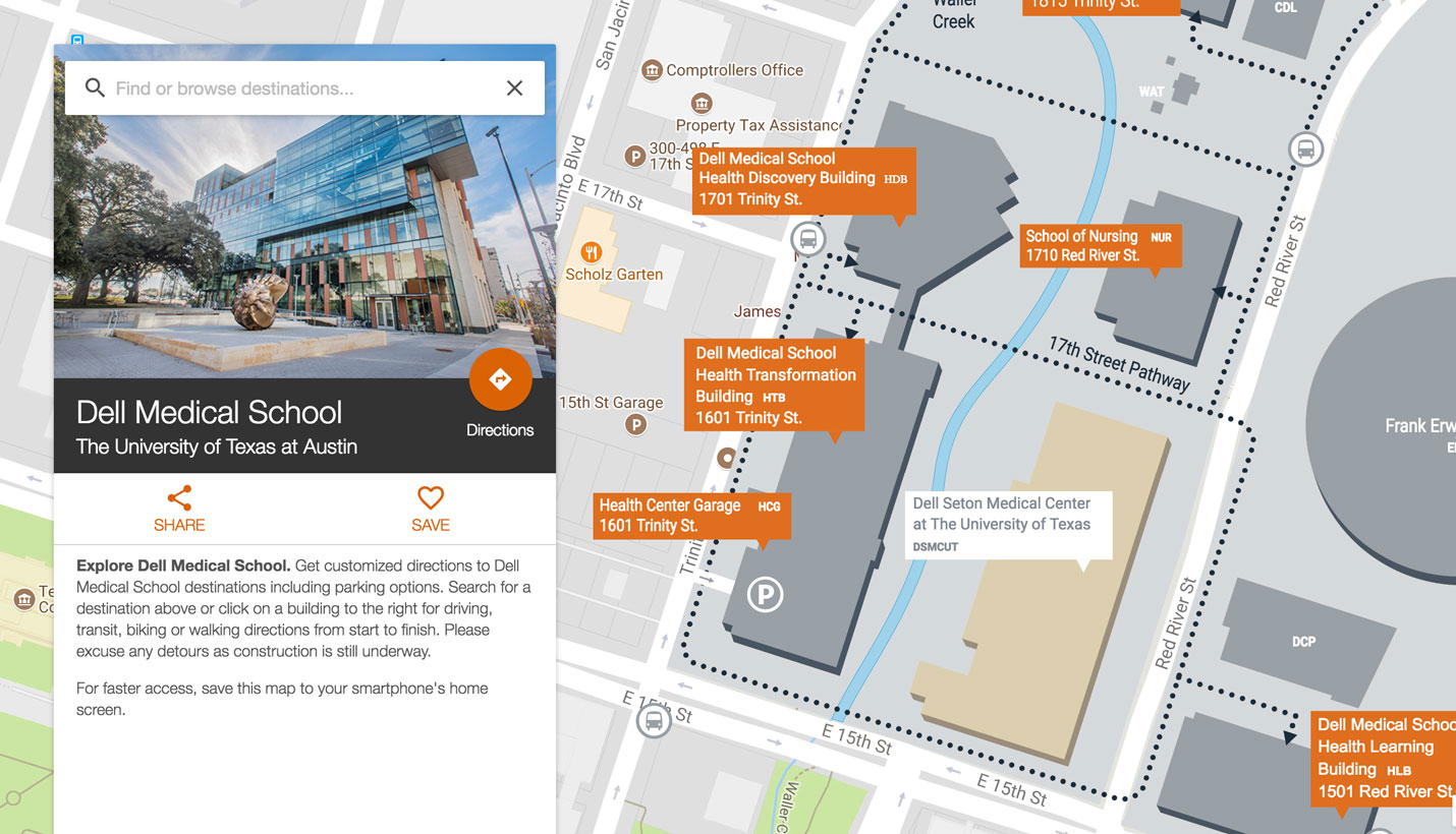
As a new medical school that anchors a growing health district, Dell Med wanted to make sure it would be easy for the students, visiting faculty, physicians and others to arrive and get to their destinations easily. In particular, it was important for the school to be accessible to people from across the community and it needed a wayfinding tool to help visitors arrive, park and get to things as varied as doctor’s appointments and community-focused events.
I was able to take the existing identity and wayfinding experience, designed by Page’s Branding & Graphics studio, and adapt it to my customized microsite map. It is a seamless experience from the physical to the digital wayfinding.
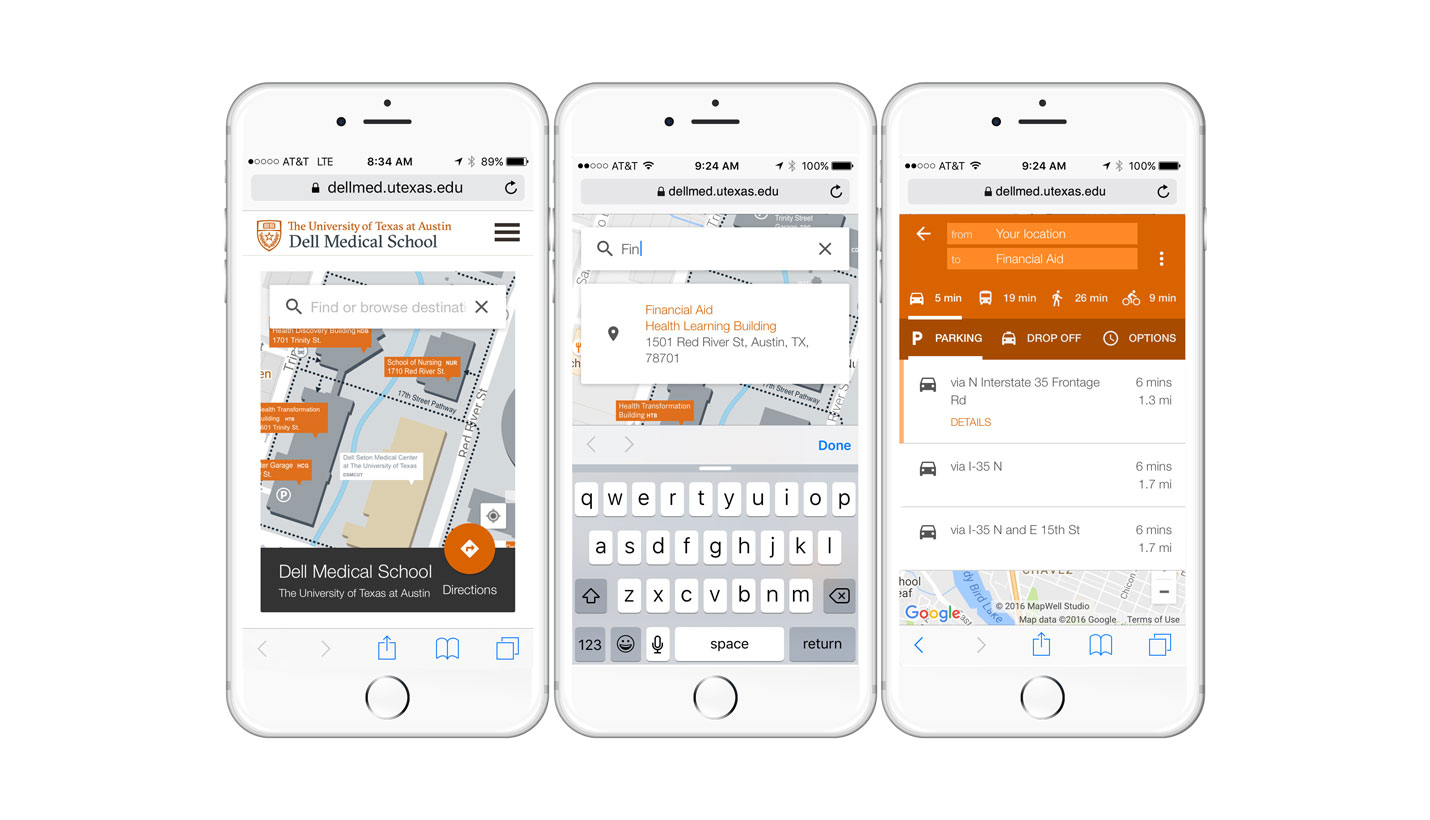
MapWell is optimized for all platforms and uses Google Maps as its base with a customized map layer. All of the unique information about the campus is held in this layer.
The map is highlighted on the homepage of the Dell Med website and may soon be added to the school’s wifi splash page.
The user can search for any destination—a parking garage, a building, a class room, lab or an office. Options for driving, transit, biking or walking are all provided. All destinations and landmarks have photos to facilitate the wayfinding experience. The site even provides directions to bike racks—perhaps a first for a wayfinding website.
The map also includes destinations that are not contiguous with this campus, like the Dell Children’s Medical Center buildings at the Mueller site and we will continue to evolve it as the school grows.
To learn more about the Dell Medical School's visual identity by the Page/Dyal Branding & Graphics studio, click here.
04/20/2018
People
Related Posts
- A District Built For Health
- Overview: Dell Medical School at The University of Texas at Austin Updates
- Winner: Community Impact Award
- New School of Thought at New School of Medicine
- Sustainability Design Leaders Tour Dell Medical School
- Dell Medical School Specialty Clinics Open
- SXSWedu Announces Learn By Design Finalists


