


Chiseled in Stone and Brought to Life
At Page/ Dyal Branding & Graphics, we like to think of ourselves as type connoisseurs. We agonize over type selection, and then work to make sure it's the "right" cut, the right weight, the right size, and kerned just so. We love the great old font houses and foundries, and we delight in finding new artisan foundries.
In our multi-disciplined practice, we produce type on paper, on glass, in vinyl, silkscreened, fabricated in aluminum, laser-cut in steel. You name it. But we've not had an opportunity quite like we had recently.
At the end of 2014, we were honored to have been selected by The University of Texas at Austin to design a new brand identity for its academic realm, which includes 18 colleges and their supporting departments. The longhorn symbol, which is perhaps the most recognizable and iconic symbol in college sports was not, of course, a part of our charge. It will never, ever, change.
After exploring and testing countless font possibilities for the new identity, we settled on GT Sectra, a relatively recent font designed in 2014 by Grilli Type, a small independent Swiss type foundry. To us, it has just the right scholarly vibe with some idiosyncrasies that make it interesting and distinct. It's also beautiful. And the "Th" ligature sealed the deal for us. Our client agreed with the selection, and it was done.
The new university identity has been applied to websites, brochure, stationery, posters, scoreboards, banners, and everything else you can think of.
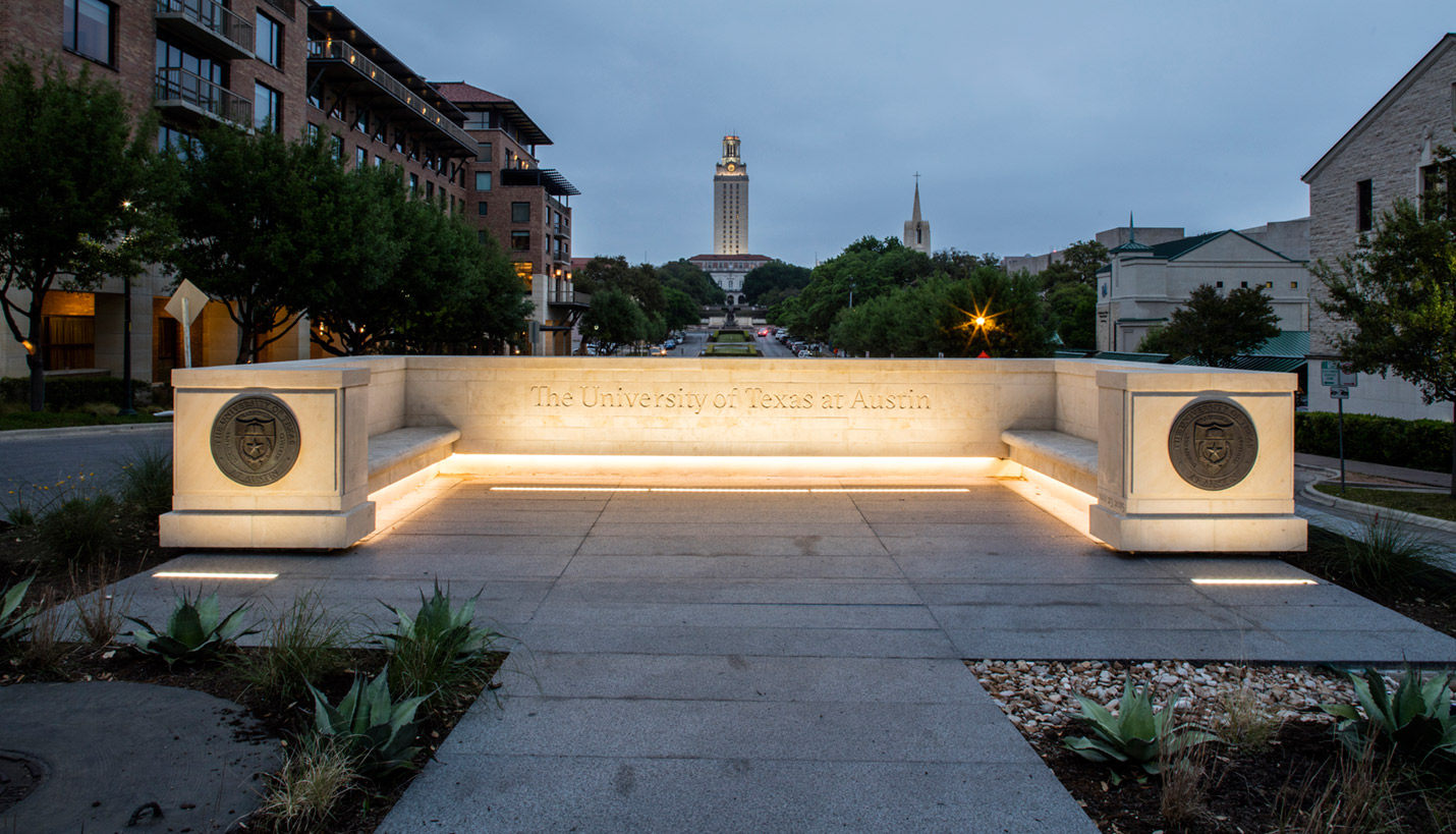
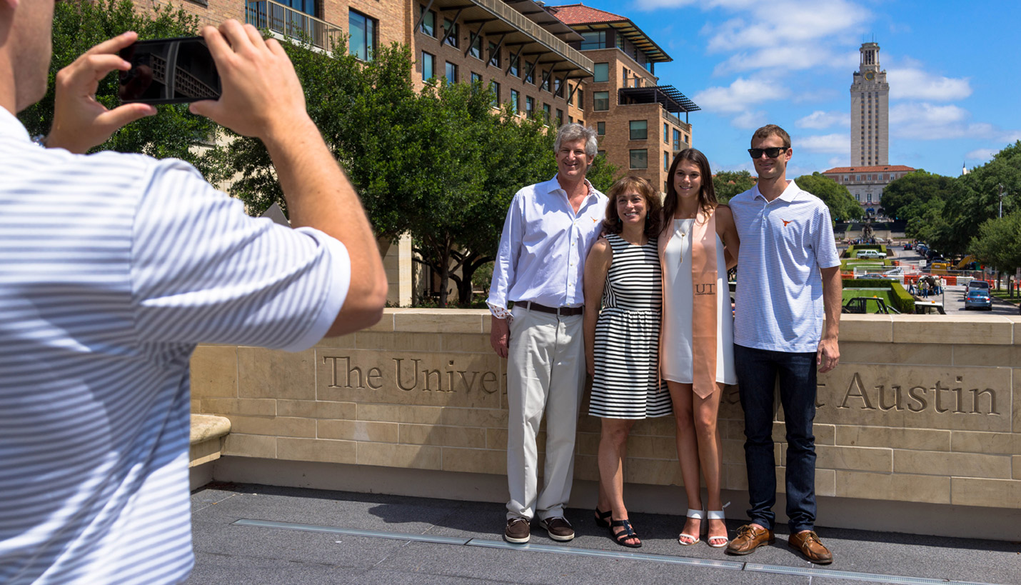
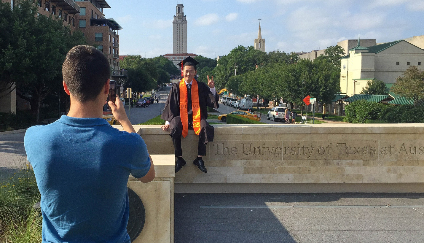
Parallel to this project, UT Austin also engaged us to design a new, formal entrance to the university. The site is perfectly aligned with the University Tower and the Texas State Capitol Building. So in addition to marking the campus entrance, our design was also to provide the definitive photo spot for new graduates posing in their caps and gowns.
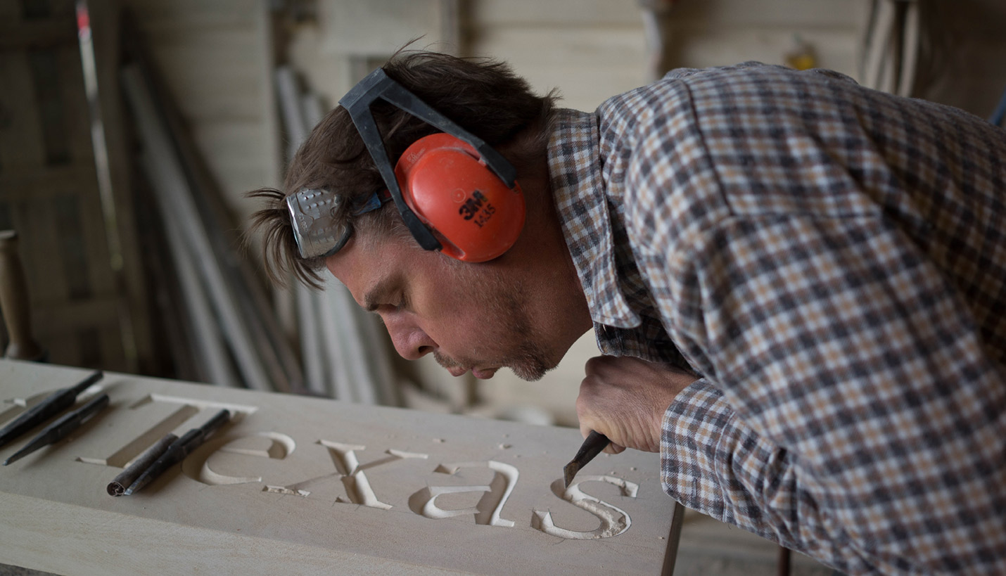
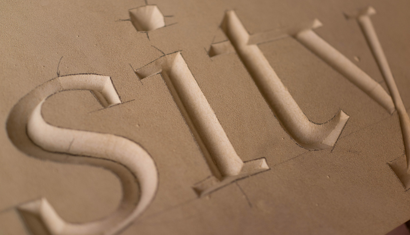
The university seal is a key part of the design, as well as our new logotype, also rendered in GT Sectra. We worked with master stone carver Matthew Johnson, to carve the logotype into the hand-selected Texas limestone. Its chiseled by hand – old school – using time-honored skills and tools that go back to the Renaissance.
Carla Fraser, Principal of Page/ Dyal Branding & Graphics, likes to note the happy coalescence that we were able to have the new font chiseled into stone when we did. The identity had already been approved by President Powers and the other stakeholders. There's something enormously satisfying about it all. A satisfaction that just doesn't match digital applications or ink-on-paper. We're humbled and proud.
Contributed By
Herman Dyal
08/12/2016


