Branding & Architecture
Last week at the 77th annual Texas Society of Architects Convention, Page Principal Herman Dyal, FAIA, spoke about branding and architecture. His lecture detailed why branding has become so important for companies and proposed that it could also be added to Vitruvis’ tenets of architecture. His examples of fully integrated branding and architecture ranged from icon institutions such as the Guggenheim to Stefan Sagmeister’s identity for the Rem Koolhaas-designed Casa da Musica. Dyal then focused on his work at The Harry Ransom Center (HRC) at The University of Texas at Austin as an illustration of the potential for an integrated process and result.
HRC is a repository of international significance housing more than 36 million literary manuscripts, one million rare books, five million photographs and more than 100,000 works of art. The collection ranges from one of three copies of the Gutenberg Bible to the entire archive of Colombian author and Nobel Laureate Gabriel Garcia Marquez.
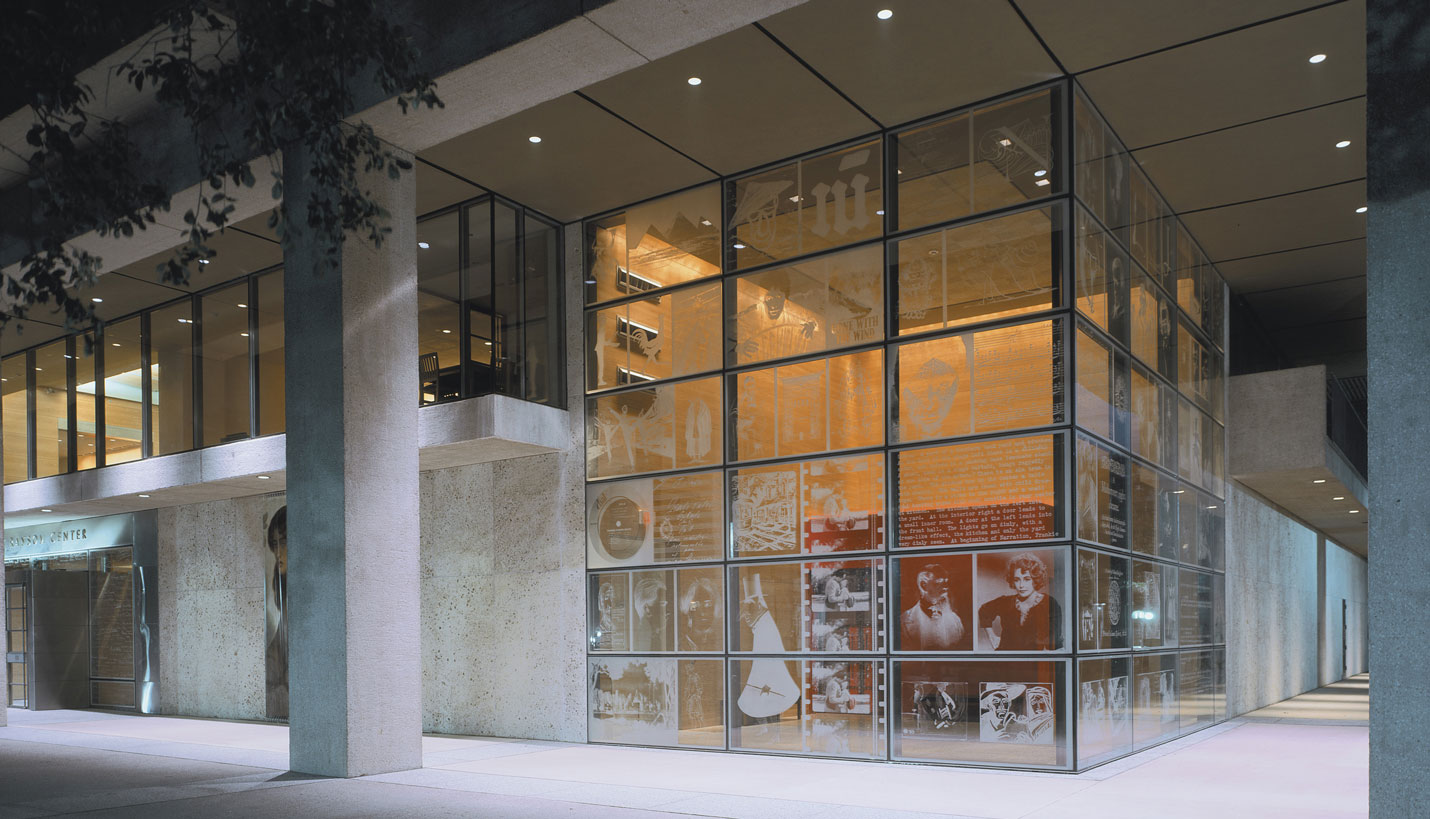
“It is the treasure chest of UT Austin,” he noted, “and one of the nation’s finest research libraries.” Dyal had the opportunity to collaborate with Lake|Flato Architects and HRC while the building was undergoing renovations (at that time Dyal was the design partner of fd2s). Built in the 1970s, the building has always been somewhat of a fortress. The 2002 renovation added transparency to the facades, introduced new galleries and updated facilities for storing and maintaining the institution’s collection. It also provided an opportunity to engage the public and students in a more direct way.
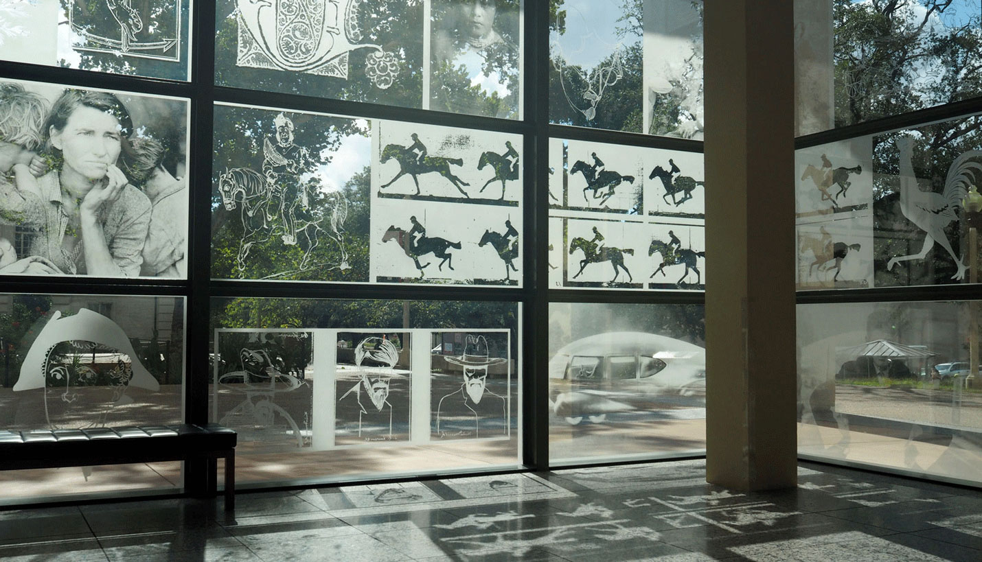
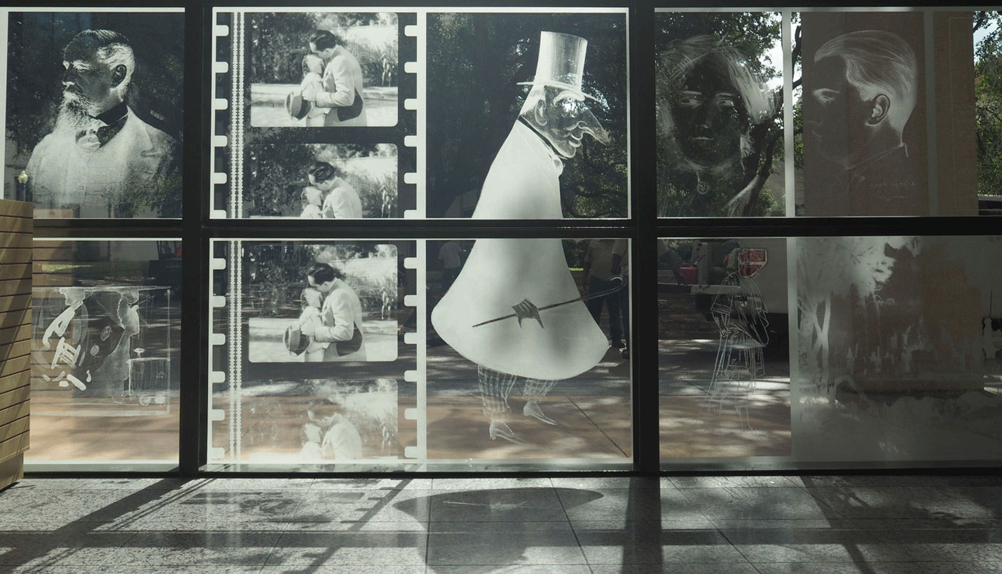
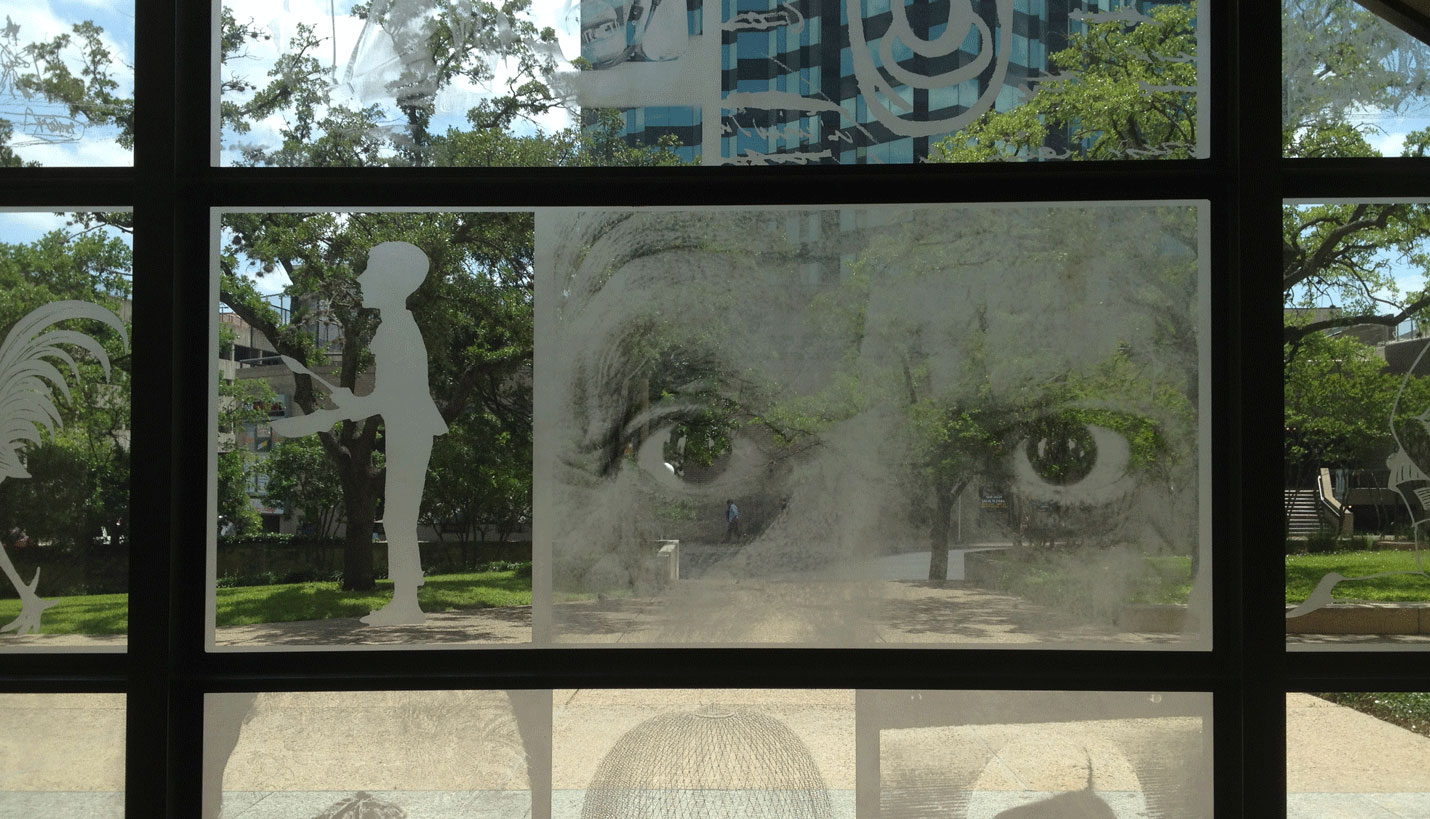
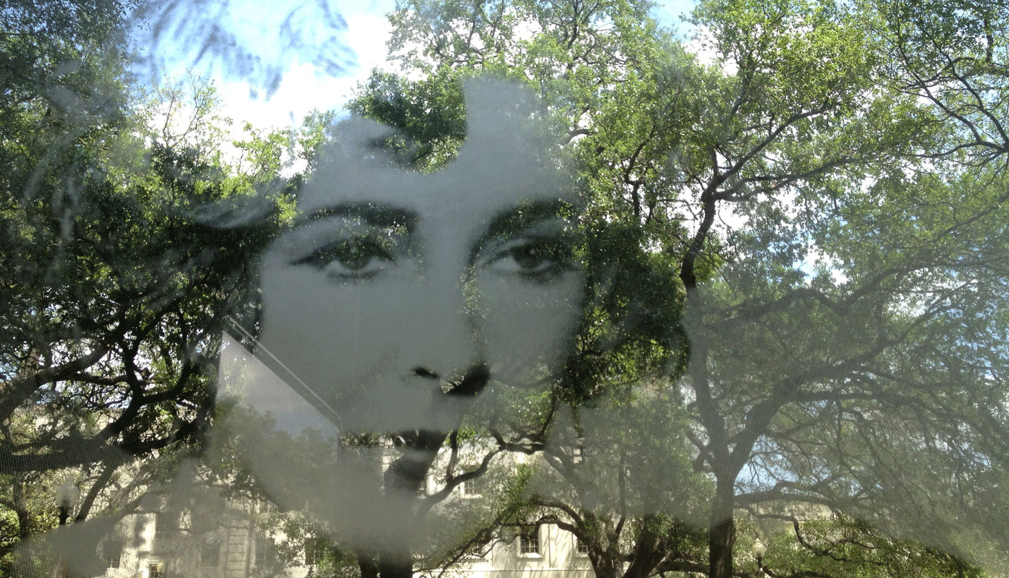
“We looked at the important role HRC plays and helped them develop a brand promise,” noted Dyal. They focused on the following idea: The HRC is the custodian of some of the most important literary and cultural artifacts in the world. The design team then took a range of images that would represent the collection and “what the HRC is” to the public and put them on display in the form of super graphics on the building’s new ground-level windows.
“They are subtle super graphics,” said Dyal. The acid-etched images enliven the building and are “appropriate for the building’s academic setting.” He appreciates their ephemeral quality and the fact that the graphics and the building change throughout the day depending on the light hitting them. For Dyal, the HRC graphics are a clear illustration of how a brand promise and aspects of an institution’s identity can be incorporated into architecture seamlessly.
The graphics have indeed acted as an ongoing expression of the HRC and a vehicle for social engagement. Window Wednesdays were introduced on Instagram as a weekly celebration of the building and the institution’s identity.
11/08/2016


